Conversations
Is Debranding a Good Thing?
The article “Debranding Is The New Branding” on Bloomberg.com got us talking about the merits of simplified brand identities and whether these pared-down treatments are here to stay or just fad and fashion.
Cast
-

Ben Regan
Étude Digital
-

John Short
Étude Digital
-

Yvonne Hsu
Étude Digital
-

Gianfranco Valentini
Étude Digital
-

Gonzalo Alatorre
Étude
-

Kevin Meronuk
Étude Digital
This is a really interesting article on debranding, definitely worth a read.
If you would like to read it, you can do so here.
-
Interesting article. Is debranding a thing?
-
What goes around comes around. That’s their old logo.
-
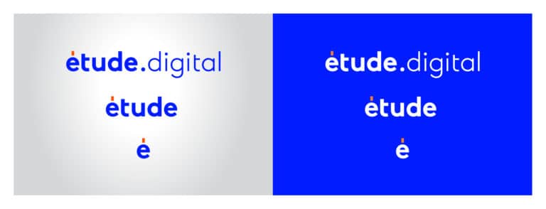
Seems to me that the term for the trend is, from the start, a flawed one. Branding, or to brand, means the effort put into the promotion of a particular product or company by means of advertising and distinctive design. Changing the logo to a simpler logo, or even reverting to an older version of the logo is by definition branding. But the article is interesting nonetheless as it is pointing out how branding is evolving. Case in point how logos now need to be responsive and be able to not just scale in size, but scale in elements. Here is an example of how our Etude logo was designed: Full wordmark (that is also the URL), just the word étude. And then just the é. Here’s some insight into our new brand .
-
The debranding trend is nothing more than fashion, I think. The same as how web stuff is moving in the opposite direction and going more detailed.
-
There was an interesting point about how everything is being designed mobile first now, which means being clear on small screens and in small spaces—which is part of why we might be seeing the overly simplified identities.
-
Yeah the CBC logo did it many a moon ago and simplified it down because their old logo was too hard to translate on to TV screens. It’s also brought the rise of the responsive logo.
-
Is this our first “Conversation”. @Gianfranco get in on this man. @Yvonne Hsu where you at? Is debranding a thing?
-
I think having the flatter logos works well on web for sure, and that definitely helps to push the shift.
-
Yeah, drop shadows and multiple borders/strokes don’t really scale down that well on screen.
-
I swear McD’s new identity is a copy of BK lol XD
-
Weird that the article calls this trend “debranding”, I think it's the opposite and brands actually become stronger with their simpler logos.
-
Yep. But I think they can only do that once they’re established.
-
^This! Some brands I’ve never heard of and their simplified version is just confusing lol.
-
A lot of startups are coming out of the gate with these streamlined identities though, knowing the landscape they are entering.
-
The mobile-first approach is interesting, because phone screens are getting bigger sizes and dpi's. You would think brand elements can be displayed with more detail now. Could be that in the mobile case, logos become part of the UI in a way, and need to be easily recognizable, clean and simple.
-
They are coming out the gate like that, but it’s because they’re fitting in, because it’s the fashion. In my opinion.
-
Also, the companies they used for the “disruptors” examples are amazing. If you haven't heard of Juicero and Theranos, please do. Hilarious silicon valley craziness.
-
Classic. “A cold-press juice company called Juicero was one of the top-funded hardware startups in Silicon Valley last year. It promised a $400 countertop juice-pressing appliance that squeezes healthy beverages out of proprietary bags, delivered to a person’s doorstep on a subscription basis for $5 to $8 apiece. But now that the hardware has hit the market, some investors have been disappointed after figuring out that Juicero owners can squeeze juice from the proprietary juice bags by hand, without the $400 appliance.” https://www.theguardian.com/technology/2017/sep/01/juicero-silicon-valley-shutting-down
-
Some people just like to be extra bourgeois!
-
I agree with John. It's also 90% trends and what's fashionable.
-
Hey. Yeah agree with y’all. Also the term debranding is incorrectly used. Branding is all the effort that is involved in creating a value perception, from the identity to the marketing and advertising. What the trend is best defined as is simplification of the brand identity (to get attention). No? I think Gianfranco said it well. They are branding even more by doing this. Agree that it is all fashion. I think phone screens have a lot detail rendering capabilities already. Maybe it is related to identifying that the newer younger generations are not so interested in these brands so they are trying to appeal more to the older generations by looking more like they did in our youths. What a fantastic article. Thanks for sharing!!! So here is a thought: the work we are doing for Moxi is both, really simplifying, and then making it complex again.
-
I think the logo shapes are so simple, that we can add elements and textures to them and still keep the brand graphically clean.
-
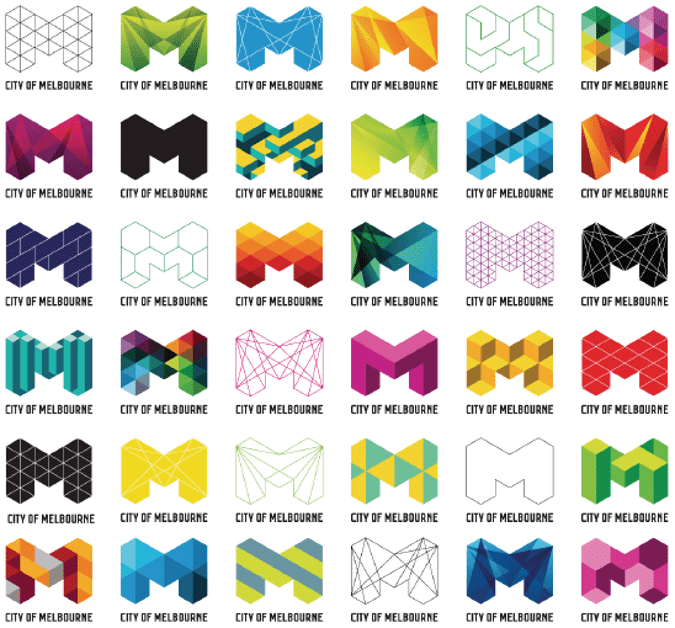
The City of Melbourne does that kinda thing well, and the Casa da Musica takes it to a whole other level. https://sagmeister.com/work/casa-da-musica/
-
Is debranding a thing? From my perspective, I think it is juts a way to try and stand out. Possibly a way to appeal via nostalgia, and show the brand that we used to love as kids. The NFL has tried it for a few years with the vintage uniforms. It is cool, and gets people talking. One thing we can't forget is that back in the good ol' days, there were a lot of reproduction limitations that we don't have at the moment. Now, screens and much better printing capabilities came into play, so we all went into the 3D logo world with lots of gradients drop shadows, you name it. But at the end of the day, it achieved its purpose: These brands got a lot more attention that they were not getting before. So it is a win.
Is Debranding a Good Thing?
Is debranding a thing? An article featured on bloomberg.com got us talking about the merit of simplified brand identities.
See the Results